Works
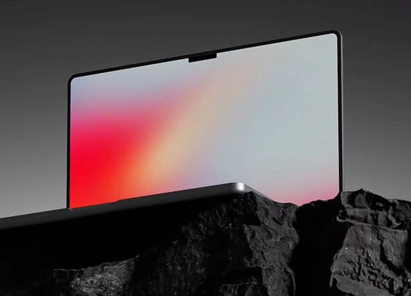
Glass Portfolio Redesign
Modern, transparent UI with faster navigation and cleaner content structure.
Overview
A portfolio refresh focused on a modern glass look, clearer hierarchy, and faster access to work case studies. The layout emphasizes readability while keeping the theme lightweight and transparent.
What I Did
Reworked the Works experience into a clean grid with dedicated case-study pages. Standardized spacing, improved navigation labels, and aligned cards with a consistent glass surface.
Outcome
Work items are now discoverable and clickable, with space for details like role, stack, and decisions—without adding heavy UI.